
The Design of Everyday Things
Perhaps one of the most widely read books to then be summarily ignored when building products.

The simple premise in Donald Norman’s seminal book, originally titled The Psychology of Everyday Things, continues to be violated all over the place all the time.
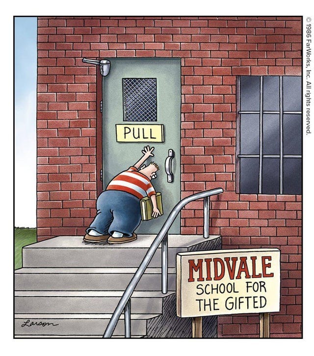
We laugh of course at the Far Side above, but how often have you seen push doors with pull handles? Or take, for instance, Microsoft’s insistence in many of its buildings to use a pull handle on slide doors. One of Norman’s key insights is to design things in manners hard or impossible to misuse:
Push doors should have push plates, which you cannot use any other way.
Slide doors should have vertical slots, which, once again, you cannot use any other way.
These simple premises continue to be violated, and I can’t understand why people insist on making things hard. Another Microsoft example: I once moved into Building 88, one of Microsoft’s then-newly-designed office spaces. It had a bunch of shiny, smooth, white surfaces along hallways which engineers inevitably wrote on, only to discover they weren’t whiteboards and things couldn’t be erased. Eventually the company spent even more money to print and affix “Not a Whiteboard” stickers to all those surfaces (instead of, say, designing those surfaces to not be easily mistaken as whiteboards).
Worse yet, I was once confused why the wall in the front of one Microsoft conference room was filled with marker doodles, interfering with projected presentation content, until I figured out that, for reasons quite unclear, architects had designed that room to have a large, waist-high wide tray on that front wall, resembling marker-holding trays under many whiteboards. Mind you, this tray held nothing useful. The room did not at all benefit from this inexplicable tray. But it sure did encourage people to draw on the wall right above it, since it sent all the usual signals of “Write Here.”

One last architectural example: I’m dumbfounded by the number of modern buildings — shiny, expensive, premium-architecture-firm sorts of buildings — which continue to feature men’s bathrooms where the main door, when briefly swung open, reveals the sight of eight men standing at urinals in various poses deliberately avoiding awkward eye contact. Do they not teach the very basic concept of line-of-sight in Architecture 101? The best practice, which you’ll see in many, many buildings, is to place a wall or turn upon entry such that direct line of sight for the wider public is never possible. And yet.
Everyday Things
The frustrating part is that everyday things continue to be so poorly designed. Consider the splash Oxo made 35 years ago when it debuted — brace yourself — softer, wider can opener grips. How many of these things hurt your hand even by reading this list?
Lawn mower pull cords
Wrenches
So many door handles
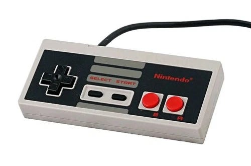
Consider the original Nintendo controller, which upon reading this sentence probably makes your thumbs sore recalling the Konami Code. Thank goodness some sort of ergonomically-minded designer joined the N64 team.
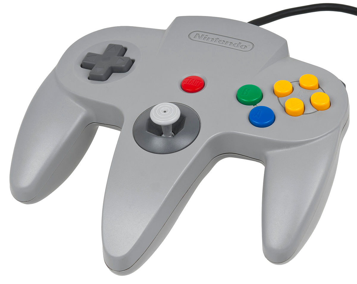
Ignorance of ergonomic considerations is only part of bad design. The other part is the easy misuse afforded by terrible designs.
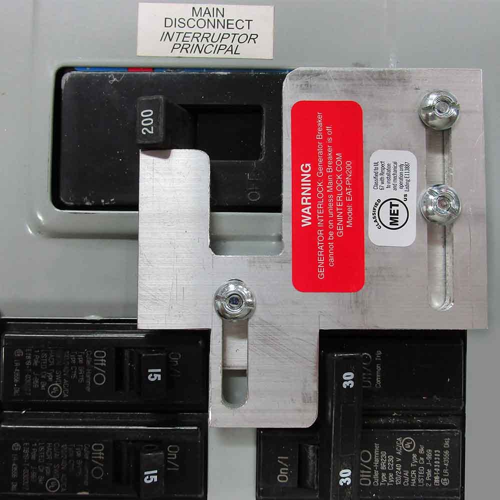
Great design makes misuse impossible and the path to success obvious. Consider the breaker interlock above, used in circuit boxes in some homes. Its purpose is to prevent accidental backfeeding, where you electrocute utility repair workers by pumping electricity into municipal power lines during an outage. In the picture above, your goal is to power your house by feeding your generator into the 30 amp circuit in the bottom right. That circuit is currently off whilst the main 200 amp connection to municipal power is on. It’s clear, after looking even a moment at the silver sheet metal, how the interlock protects utility workers. This is great design: cheap, obvious, useful, incapable of misuse.
You could either require these, or alternatively do frequent public service announcements about the dangers of electrocuting utility workers during storms. You could countenance bad design and, in Microsoft parlance, print a bunch of stickers that say, “Not a Whiteboard.”
You May Ask Yourself
Consider these questions whenever you next design something.
Is it possible to misuse?
In fact, does the design invite misuse?
Why am I printing labels explicitly telling people how not use use this device? Why am I bolding a bunch of sentences in the manual?
And learn from others. If you’re old enough, you might remember TiVo’s many-award-winning remote control:
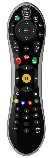
It felt good to hold. Buttons were deliberately shaped differently, some with textures for easy operation even in the dark.
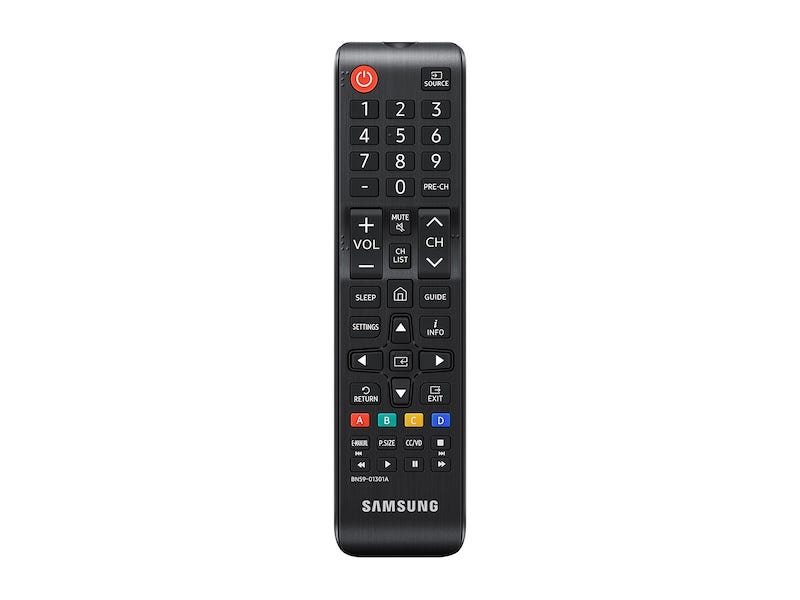
Or you could alternatively consider a modern Samsung TV remote, designed some 25 years later. It has sharp edges. Many buttons are undifferentiated in the dark. Your most common actions in the modern world, Play and Pause, are literally the smallest buttons on the entire device, placed somewhere you cannot reach without double-handed operation.
I would understand Samsung if their remote had come 20 years before TiVo. But coming 25 years after TiVo was so popularly lauded for its innovation in design (following a pattern you’ll remember above from Nintendo → N64) is only explainable by deliberate obstinance or unforgivable ignorance.
Software Design
The software world is so full of bad designs that it’s hard to pick any one particular example, but an obvious one with three-decade longevity is the Windows Control Panel.
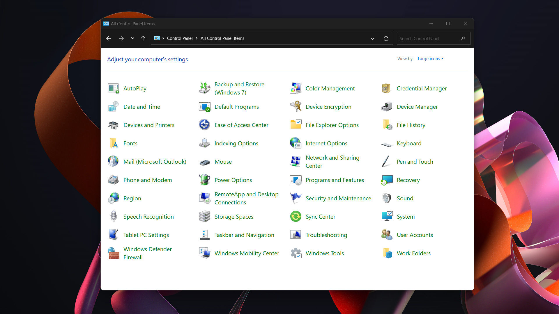
You can’t quickly find anything in it
They keep changing where everything goes, shuffling deck chairs every release of Windows
PMs are so proud, with nearly every release, of their “improvement” on its design
There are some sections which can nest three layers of tabbed dialogs, each like a portal into the next circle of the Inferno
It includes so much information no user needs. Want GUIDs for various hardware device driver properties? Here are six! How about some top Hayes AT commands? I’m sure they’re in there too.
It nests layers of visual lipstick like pasting newer wallpaper over old. The top-level Control Panel looks great, but it takes only one or two clicks before you begin time-traveling through a history of Control Panel designs over the decades, with you exploring Windows history like some sort of GUI archeologist.
There are many design principles of which I’m no doubt unaware, but I’ll rattle off a few obvious things:
Make the most common actions easy.
Make destructive actions reversible. If that’s not possible, warn clearly before taking the action.
Group like features together in a coherent scheme so users can tell they’re getting closer to what they’re looking for when they move in the right direction.
Cut uncommon configurations to make the majority case clear and simple. More knobs is often worse, not better.
Relegate advanced features to advanced methods. Did you know you can force a Mac printer to watermark all pages? It’s nowhere in the UI. You need to do some crazy CUPS command (
lpoptions -p "Printer_Name" -o watermark=CONFIDENTIALor some such).Consider flattening hierarchical navigation models. An example is how VS Code supports Search/Filter functionality to find exotic settings.
Spread the Love
Many other things can be done to improve software design, but overall, I’d just love for the world at large to integrate more design thinking in objects and spaces we encounter every day.
If you control some aspect of a product, building, or object’s design, I’m counting on you to improve all our lives! Spread the word.

Wait until you find out about trying to have everything connect to wifi/Bluetooth with unintuitive designs and controls.
This very much reminds me of a programming principle of “making illegal states untepresentible”.
Instead of focusing on defensive programming that catches/handles illegal states you should instead always think if its possible to design the code in such a way that illegal states can not even be represented by it.